
Information Aesthetic Visualization: Exploration of the Calendar
Abstract
Most software calendar applications today present appointments textually to the user in a grid-like-graph that resembles traditional paper calendars. The user is presented with content that is visually mundane and unappealing. Web calendars such as Google Calendar and desktop calendars such as Microsoft Outlook do not offer users with much ability to personalize the look of their appointments. Users can make "categories" and assign a color that represents a type of appointment (e.g. Blue for Business); however, the event itself is not unique from other events.
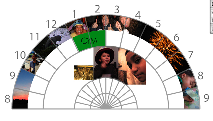
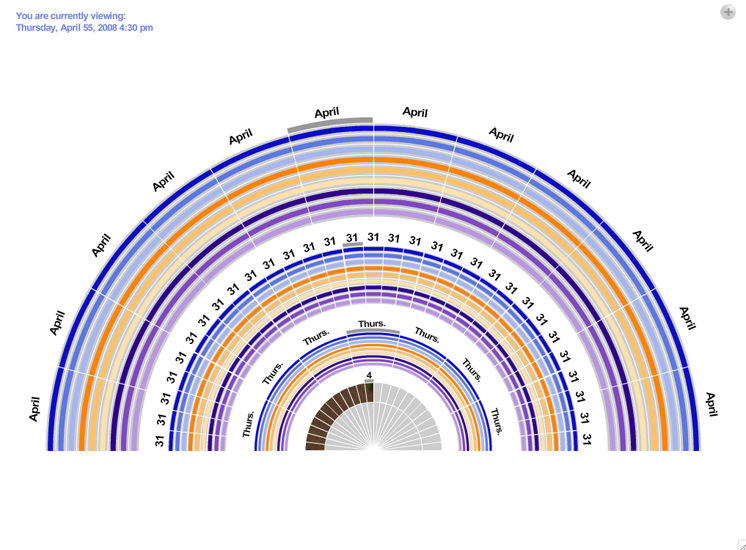
Current digital calendaring systems do not extend representation of chronological events, recurring events or even priority of events in a manner different from traditional appointment books. In addition, the primary mode of viewing events in digital calendars is chronological and does not offer users the ability to view events in a variety of other ways such as a user viewing all doctor related appointments.
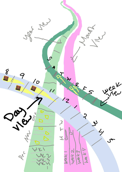
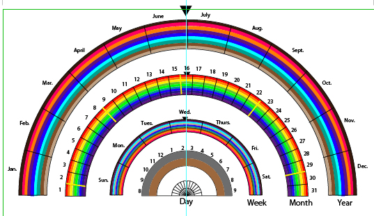
There are two primary phases to this project: design and implementation. The design phase consisted of: exploring various metaphors for the calendar (e.g. Time has a circular motif or "Life is a Highway"), developing ways to filter and display data which will coincide with the metaphor, investigating and researching a variety of visualization techniques by looking at current projects, and delving into current research in this area.
Developing a metaphor that users will be able to comprehend in all aspects of the calendar is important because it will be the underlying visual schema for the design. For an example, with the metaphor "Life is a Highway", the art technique of perspective could be utilized to display events based on user's preferences and interaction considerations could reflect the idea of someone moving along on a highway. Through a process of iterative design, each metaphor was explored in depth using a variety of methods.
Images

 by Ada Tse.
Website designed and developed by Kelley Piering.
by Ada Tse.
Website designed and developed by Kelley Piering.Valid XHTML Strict and CSS.